


Top 6 Stylish & Popular Aluminium Bathroom Gate Designs of 2025
May 22, 2025
Simple Tips to Keep Your Furniture Safe from Fungus On Wood in the Rainy Season
May 22, 2025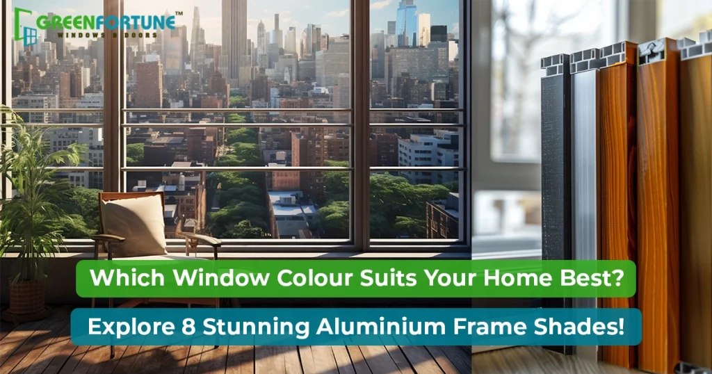
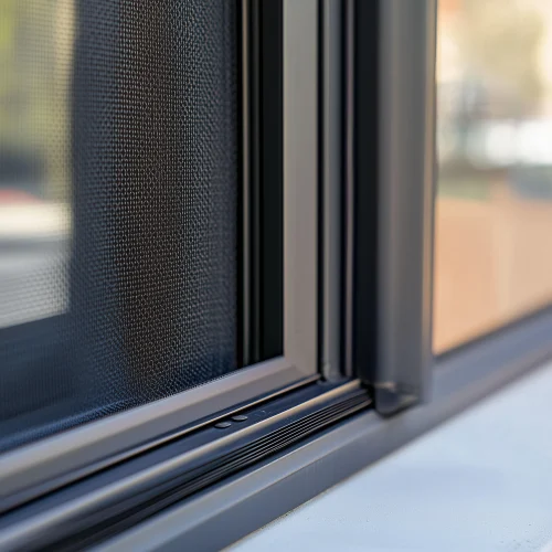
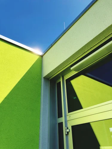
The entrance to your home is picture-perfect, and so is your interior and flooring. Yet something about your home still feels incomplete. Why? It is your window frame. Aluminium window frames may look sleek and durable, yet their colour can dramatically alter the aesthetics of your space.
Most homeowners think of the default option of the standard silver or white frames when it comes to aluminium windows. However, they miss a golden opportunity to elevate their aesthetics.
Aluminium windows come in an assortment of powder-coated and anodised finishes, which can add contrast, harmony, or drama to both interiors and exteriors.
This blog explores the top aluminium window colours to complement modern home aesthetics - from minimalist whites to dark charcoal tones. No matter your desired effect, this guide can help you select a shade that complements rather than clashes with the style of your home.
Why Colour Matters in Aluminium Window Frames?
The hues you select for your window frames don't only serve aesthetic reasons; they have a direct impact on how people experience and perceive a space.
Aluminium windows now come equipped with powder-coated and anodised finishes in various hues, so you're no longer limited to choosing basic options alone.
Choosing the Right Aluminium Window Colours
Aluminium window colours complete the interior palette. You can align the aluminium windows' colours as per your interior theme.
Read more - Everything you need to know about Plumbing
1. Matte Black: Brings Drama to Minimalist and Industrial Homes
Perfect for modern, industrial, and urban homes, Matte black creates a striking contrast against white or neutral walls while adding visual definition in open-plan spaces with glass, concrete, and steel elements. It works because it ties these features together.
Design Tip: For better styling, pair matte black frames with matte black door handles, light fixtures, or furniture legs in order to complete their look.
Why it Works: Matte black adds definition to large open spaces without visually overwhelming them. It contrasts beautifully with white walls and glass partitions.
2. Charcoal Grey: Subtle Sophistication
This hue works beautifully in contemporary or transitional homes, offering depth without being as dominant. Charcoal hues pair beautifully with both cool and warm colour palettes for versatile room designs.
Excellent for: Transitional designs of homes featuring both contemporary and classic decor elements, or spaces featuring natural textures like stone or linen as the primary focal points.
Why It Works: This shade works well in either warm wood tones or cool metals, and it manages dust and grime better than lighter finishes, making it suitable for busy households.
3. Textured Bronze: Warmth Meets Luxury
This finish combines warmth and luxury in one elegant package. The textured finish gives this material a tactile, artisan feel while maintaining its durability as an aluminum alternative.
Where it Stands Out: Perfect for Mediterranean, rustic, or industrial luxe homes where layered textures matter, such as earth-tone walls, leather furniture, and copper-toned accessories.
Why It Works: The texture diffuses light gently while gradually developing a warm patina with time, adding character as your home ages.
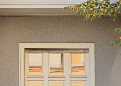
4. White: Clean, Classic, and Understated
This colour choice is ideal for Scandinavian, coastal, and minimalist homes as its neutral tone blends seamlessly into walls, allowing other design elements to take centre stage.
Why it Works: White blends seamlessly into walls, making windows "disappear" while showcasing other design features more prominently.
Best for: Light-filled rooms featuring pastel tones, natural wood grain textures, and linen textures, as well as homes with ample green space outside.
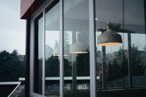
5. Anodised Silver as the Contemporary Neutral
Silver anodised finishes have a metallic sheen that reflects light, creating larger spaces by reflecting natural lighting into them and making rooms seem brighter.
Where it Works Best: Kitchens, studies, or high-traffic zones featuring stainless steel, marble, and black-and-white designs. Why It Works: Metallic sheen adds a luxurious finish, while its corrosion-resisting properties make it suitable for coastal or humid environments.
6. Olive Green and Sage: Nature-Inspired Calm Best Used in Sustainable, Eco, or Biophilic Designs.
Earthy green hues pair well with natural stone, wood, and plants, bringing nature inside for a sense of serenity. These tones create a connection to nature, which is especially popular in climate-sensitive homes.
Pairing Suggestions: Sage frames pair beautifully with jute rugs, terracotta pots, and large indoor plants; olive pairs well with stone cladding, reclaimed wood decor, and rattan furniture.
Why it Works: These tones add subtle color without overpowering a room, working well alongside soft neutrals and earthy tones to reinforce biophilic design approaches.
7. Corten Rust or Weathered Steel for an Earthy Touch
These finishes create the impression of aged metal, perfect for homes that embrace character-rich heritage themes while keeping an earthy charm.
Where to Use: Ideal for farmhouses, rustic retreats, and urban homes featuring reclaimed materials. Looks especially striking when combined with red bricks, terracotta, or slate claddings.
Why It Works: These frames age gracefully without demanding perfection. Their patina becomes part of their charm, making them suitable for Wabi-Sabi or heritage interior designs.
8. Beige or Taupe Neutrals for a Calm Space
These types of colours for aluminium windows work great when creating an environment with a Zen or Japanese vibe in contemporary homes, as they blend in easily while adding warmth and neutrality, perfect when the focus needs to remain on interior decor rather than frames.
Design Vibe: Perfect for Zen or Japandi homes featuring minimalistic aesthetics with natural elements such as bamboo blinds, clay pots, and handwoven textiles.
Why it Works: These shades create a soft frame that doesn't dominate the view, creating visual continuity between indoor and outdoor areas.
Factors to Consider When Choosing Aluminium Window Colours
Before finalising a colour for your aluminium window frames, consider the following factors to ensure they align with your home’s style, environment, and long-term appeal:
1. Architectural Style
The window colour should enhance your home’s architectural theme.
- Modern homes pair well with matte black, charcoal, and silver finishes.
- Heritage or rustic homes look beautiful with bronze, corten rust, or warmer tones like taupe.
Stick to tones that complement the structure instead of overpowering it.
2. Exterior and Interior Colour Schemes
Look at the palette of your walls, furniture, doors, and flooring both inside and out.
- Neutral shades like white or taupe blend effortlessly.
- Bolder tones like olive or bronze can act as accent features.
Choose a colour that ties your interiors and exteriors together visually.
3. Climate and Location
Weather conditions can affect both appearance and longevity.
- Coastal or humid areas benefit from anodised or powder-coated finishes for corrosion resistance.
- Darker colours might absorb more heat in warmer climates.
Always choose finishes that are resistant to rust and fading in your environment.
4. Lighting Conditions
How much natural light enters your space affects how the frame colours appear.
- Dark shades like black or charcoal provide contrast in well-lit rooms.
- Lighter tones, such as white or silver, can brighten dim interiors.
Test your preferred colour in different lighting before making a final choice.
5. Longevity and Trends
Window frames aren’t changed often, so choose colours that will age well.
- Timeless shades like grey, bronze, and silver remain in style.
- Avoid overly trendy colours unless they suit your long-term plan.
Opt for finishes that will look just as good ten years from now.
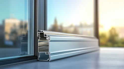
6. Finish Type (Powder-Coated vs Anodised)
The finish affects both texture and durability.
- Powder-coated finishes offer a wider colour range and matte or textured looks.
- Anodised finishes provide a sleek, metallic feel and are highly weather-resistant.
Choose the finish that fits both your aesthetic vision and your maintenance expectations.
Read more - Best Ceiling Cement Designs
Conclusion
Aluminium windows add colour and personality to your home. Choose the ideal window frame colour with our guide below for modern aesthetics so that it perfectly reflects who you are as an individual and creates a look that feels truly yours.

Discover GreenFortune - Your Trusted Partner for Top-quality uPVC Windows and Doors
GreenFortune is your go-to solution for providing energy-efficient windows and doors with visual appeal, long-term performance, and premium comfort for your home improvement plans.
Green Fortune windows and doors, made with premium UPVC solutions specifically for each application, will add visual appeal and provide long-term performance.
Choose GreenFortune now and experience our extraordinary quality, design, and customer service.
FAQs
- Are aluminium window colours more costly than regular ones?
Yes, powder-coated or anodised finishes of mill-finish aluminium cost less yet provide greater durability and design flexibility than their counterparts.
- Can I repaint my aluminium window frames later?
You could, but it would be more efficient to select the ideal colour up front. Powder-coated surfaces require specific treatments; to achieve an ideal outcome, it's wiser to choose them in advance.
- Which are the lowest maintenance aluminium window colours?
Charcoal grey and textured bronze are excellent low-maintenance options as they don't show dust and minor scratches as easily.