
10 Household Materials That Can Negatively Impact Your Health
May 13, 2025
Home Celebrity Styles: Inside 6 Famous Star Homes
May 14, 2025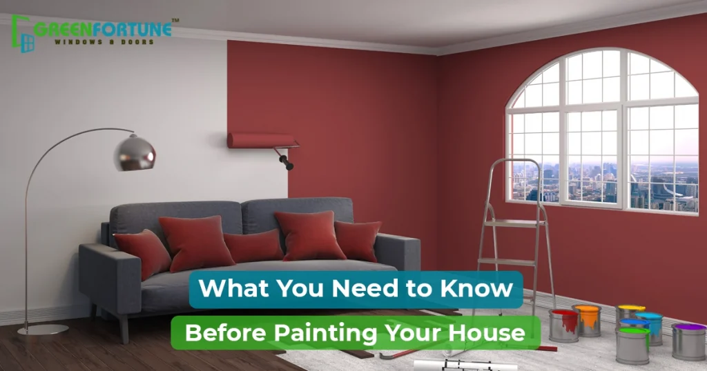
When it comes to the interior colour of house, do you know why most people get it wrong? It is not because they don’t have style, but because not everyone knows the deeper elements behind right colour choices such as how light, architecture, finish and function all come into play. You cannot choose the interior colour of house by just following the trends because colours also profoundly influence our emotions and behaviours.
This guide breaks down how to approach and plan the interior colour of house with complete knowledge and strategy based on room type, colour combination that work and more.
Common Mistakes to Avoid with Interior Colour of House
The biggest mistake homeowners make is focusing solely on the colour choices itself and ignoring how they fit into the overall design of the room. Let’s break down where you can probably trip:
1. Skipping the Light Test
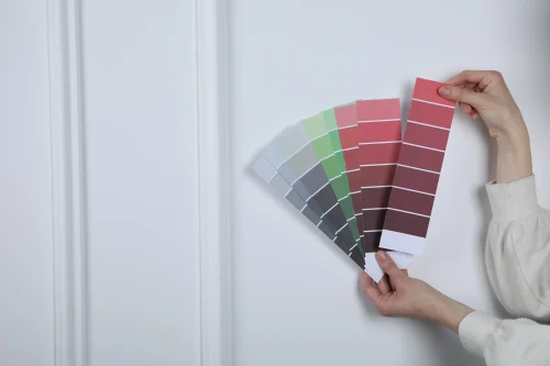
Every colour looks different under various lighting. Natural light shifts through the day, and what seems like the perfect colour on a chip might look completely off when applied on walls. Test your colours by applying them to the wall and observe how they behave under morning, afternoon, and evening light.
2. Choosing Interior Colour for Room Independently
Each room needs to work within the overall context of your home’s design. Picking colours in isolation often creates a disjointed feel. Instead, plan for a cohesive palette that flows from one room to the next. This creates harmony throughout your home.
3. Following Trends Without Thinking Long-Term
Yes, the navy blue or mustard yellow you see on Pinterest might look stunning, but will it look good in your space? Think about your home’s size, light, and furniture before committing to a trend. Sometimes, a timeless neutral will serve you better than something that’s "in" right now.
4. Forgetting Undertones
Not all greys are the same. Some have blue undertones, while others lean towards green or brown. If you ignore undertones, there is a risk of mismatching with your flooring or furniture. Always check swatches against your existing decor in natural and artificial lighting before making your final decision
Interior Colour of House - Room-Wise Strategy
Room Type | Best Base Colours | Accent Colours | Why It Works |
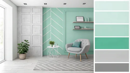
Living Room | Greige, Soft Grey, Buttery Beige | Deep Green, Navy, Terracotta | These neutrals create a welcoming vibe without overpowering other elements and make the space feel versatile. |
Bedroom | Dusty Blue, Warm Taupe, Muted Lilac | Soft Pink, Ivory | Choose calming colours that promote relaxation, while softer shades create a cozy, peaceful environment. |
Creamy White, Light Sage, Soft Grey | Brass, Matte Black, Mint Green | Always prefer bright tones to keep the space fresh and clean, while accents add personality and style. | |
Bathroom | Misty Blue, Pale Green, Off-White | Powder Blue, Light Grey | Combination of soft colours reflects light well, and makes the bathroom feel airy and serene. |
Home Office | Blue-Grey, Soft Clay, Muted Olive | Charcoal, Olive Green, Wood Tones | These hues enhance focus and productivity and also maintain a grounded and inviting atmosphere. |
Kids’ Room | Soft Yellow, Sky Blue, Gentle Coral | Green, Pink, Bright Pastels | These colours are lively yet calming and you can easily evolve them as children grow, which makes the space adaptable. |
Dining Room | Creamy Neutrals, Soft Clay, Rich Beige | Burgundy, Navy, Gold | Neutral bases allow food and decor to shine, while rich accents bring an elegant, formal feel which work best for dining areas. |
Hallway / Entry | Warm Beige, Off-White, Clay | Gold Mirrors, Black Frames, Terracotta | As the passages set the tone for the rest of the house, warm neutrals connect rooms beter and create a welcoming vibe. |
Guest Room | Soft White, Muted Green, Pale Blue | Warm Grey, Taupe, Blush | Neutral, restful tones keep the space inviting for any guest. A touch of warmth avoids a sterile feel. |
TV / Media Room | Deep Charcoal, Rich Navy, Soft Mocha | Dark Wood, Metallics, Warm Lights | Since the room is used primarily for screens, dark tones help reduce glare and create a cozy, cinema-like vibe. |
Architectural Influence on the Choice of Interior Colour Combination
The biggest influence on the interior colour of house, after personal taste, are your home’s architecture and light sources. Ignoring them leads to a constant battle between the walls and the space.
- Colonial Homes
With their classic detailing and natural wood accents, go for rich, historic tones like forest green, burgundy, or creamy whites that complement these traditional elements. - Mid-Century Modern
For homes with clean lines and large glass windows, deeper shades like navy, mustard yellow, or avocado green work well. Matte finishes keep the look sophisticated and timeless. - Contemporary Apartments
Stick to a more minimalist palette like soft greys, white contrasts, and the occasional bold accent wall to prevent visual clutter and maintain a sleek, modern vibe.
Small Homes with Low Ceilings
Avoid dark colours that will make a small space feel even more cramped. Opt for light-reflecting neutrals and pastels to visually "lift" the room. Pay attention to your lighting as well as it can make a huge difference in how the colours appear.
Expert Tips for Perfecting interior colour combination
The same shade can feel entirely different depending on finish. Before you buy the first can of paint, make these three decisions:
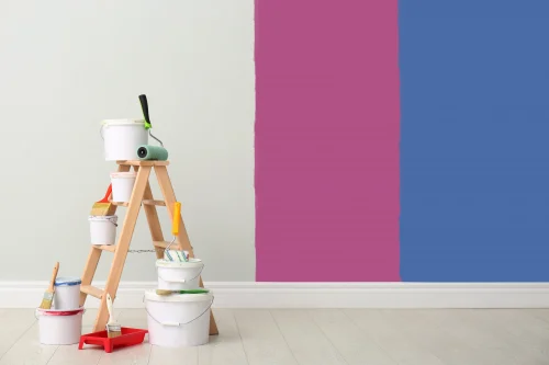
1. Test Before You Commit
Paint large patches on multiple walls. Observe them throughout the day. Colours shift with sunlight and artificial light. Don’t rely on the chip, rely on how it looks in your home.
2. Choose the Right Finish
Finish matters as much as colour:
- Matte finish hides flaws, looks sophisticated
- Satin finish is perfect for high-traffic areas
- Semi-glossy finish adds brightness to trim or small spaces
3. Balance Trend with Longevity
Use trendy colours sparingly as accents or on one wall. Keep your main palette classic and adaptable. That way, you won’t need to repaint every time a new colour trend rolls in.

Final Word
The interior colour of house isn’t just about decoration. It sets the tone for how you feel in your space. Talk to experts to explore better ideas and interior colour combinations, and most importantly, choose colours that help you feel truly connected to your home.
To complement your colour scheme, check out uPVC windows and doors from Greenfortune. They bring the whole look together and make your home feel complete.
FAQs
Q1. How do I choose a colour palette that matches my flooring?
To match your colour palette with flooring start by identifying the undertone of your flooring and then select wall colours with matching undertones.
Q2. Can I use dark interior colour for room walls in small spaces?
Yes, but it is important to use them strategically. If you use a single dark accent wall or deep-toned ceiling, it can add depth without making the room feel closed in. You can balance it with lighter furniture or decor.
Q3. Should all my rooms follow the same colour scheme?
All room colours don't need to be identical, but a connected palette helps your home look more planned. You can use repeating base tones or accent colours to link spaces while giving each room its own flavor.