


Work Meets Style: 5 Modern Study Table Design Ideas to Try Now
June 3, 2025
Modern Design of Window Frames for a House: Add Style and Function
June 3, 2025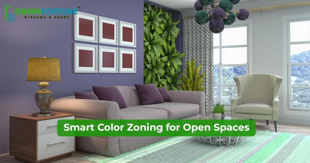
Open layouts look great in photos. But living in one? That’s a different story.
Your dining table sits next to your sofa. Your work desk faces the kitchen. The whole house starts to feel like one big box, without any flow. You can’t tell where one area ends and another begins. It gets overwhelming.
That’s where color zoning interior design comes in. It’s a simple trick to give each part of your home its own identity. All you need is paint and some smart color choices.
In this blog, we will show you how it works and how to use it to make your open layout feel more like you.
Also read: Best colours for your home: Room-by-room guide.
Why Color Zoning Interior Design Is More Than Just A Design Trick
Our eyes usually crave visual boundaries. Color zoning interior design gives you that boundary to your open layout space.
Color zoning is about using paint to create a function, set a mood and organise your space without moving furniture or buying expensive dividers.
For instance, you can paint a soft green box behind your reading chair to create a cosy nook. Use a bold color stripe above your dining space to pin the eating zone. Paint the ceiling above your work desk to mark your focus area.
See, now you will understand that you are not just decorating, and every color defines a purpose.
Choosing Colors With Purpose
And if you are wondering what the big deal is about painting a random wall with a random colour… it’s not like that.
Here’s where color psychology comes in. Each color has a subtle effect on how we feel.
- Blue or Sage Green- Calming, peaceful.
They are suitable for bedrooms, meditation corners, and reading zones
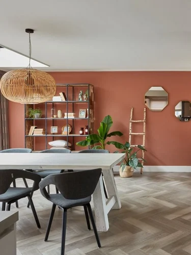
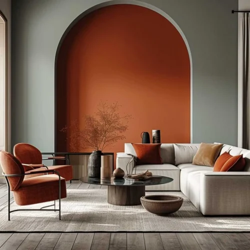
- Terracotta or Mustard- Warm, grounding.
They are great for dining areas, casual lounges, and guest corners
- Yellow or Coral- Cheerful, energising.
They are perfect for kitchens, play areas, and craft corners
- Beige or Greige- Soft, neutral, quiet.
They fit like a needle in a home office, multi-use corners, and entry zones
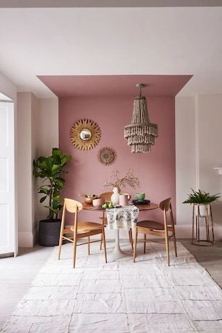
- Dusty Pink or Mauve- Comforting, nurturing.
They are suitable for personal nooks, vanity spaces, and lounge corners
- Charcoal or Deep Olive- Bold, cocooning.
They are great for TV walls, private seating, and study zones
- White with a Tint (like icy blue or blush white)- Clean, expansive.
They are perfect for shared zones, anywhere you want air or to feel breezy.
- Teal or Ink Blue- Rich, immersive.
They look good for statement walls, semi-formal dining, and library-style spaces
Try These Color Zoning Open Space Layout Ideas
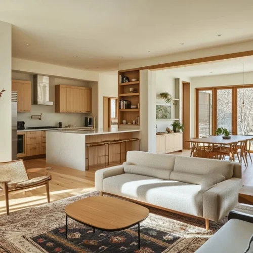
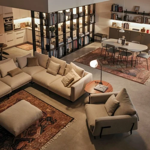
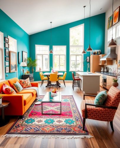
Living & dining in the same space
Use a warm neutral color like beige or grey for the living side and switch to mustard, deep olive or terracotta behind the dining section.
Kitchen that opens into a living room
Use a cosy tone like dusty pink or sage for your living room and keep the kitchen walls bright, like soft white or pale yellow.
Also read: Top 10 colours for your guest room for a warm welcome.
Open layout with a WFH corner
If your work desk is within the living room, use greige, charcoal, or muted green behind it to set it apart.
Kids’ play area with a shared space
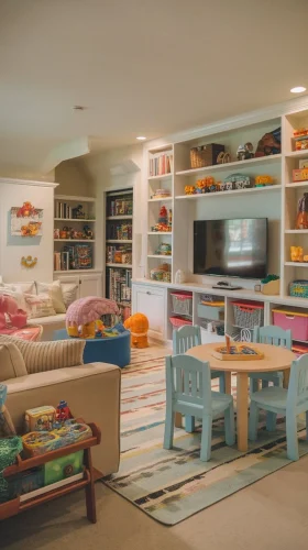
If the play area shares space with the living or dining zone, use cheerful tones, like coral, aqua or sunflower yellow to define that corner. You can paint just one wall, a section or even the floor beneath the rug.
Entryway in open concept homes
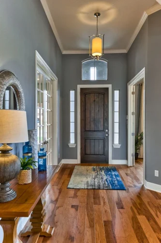
Use deep teal, earthy brown, or even a painted arch on the wall or floor zone to make the entry.
Lounge Area within a larger open floor
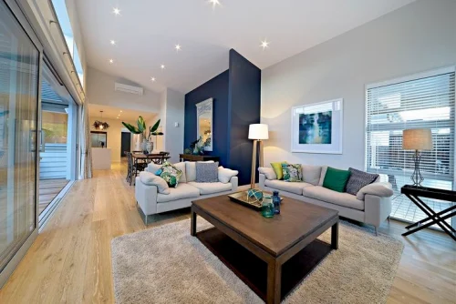
In an open layout house, it is easier for the lounge or TV area to feel lost. So, you can add bold colors, like olive green, charcoal, or deep blue, on the main wall. It draws focus and separates it from the rest of the room.
Color Zoning Interior Designs: Do’s And Don’t’s
These are not just modern paint ideas for interiors, but are practical ways to organise your open layout visually and emotionally.
Do’s
- Paint just a section of a wall behind key furniture
- Use shapes like arches, rectangles, or stripes to create soft boundaries
- Try painting part of the ceiling or a corner to define a nook
- Coordinate wall colors with nearby furniture or rugs
Don’ts
- Don’t use too many bold colors
- Don’t ignore natural light. It changes the way how colors look
- Don’t choose colors that clash with flooring or soft furnishings
- Don’t extend a zone too far. It can make the space look artificial & forced
Also read: How sunlight and weather can impact your exterior wall colour?
Final Takeaway
With color zoning interior design, you are not just painting the wall; you are bringing order, purpose and personality to your home. If you want to do color zoning for your home, start with one small area. Choose a color that reflects how you want that space to feel. Soon, you will love how the whole space looks.
If you are looking to improve your space even further, Greenfortune’s uPVC windows and doors can help. They are eco-friendly, energy-efficient, durable, stylish and complement modern open layouts!
Make the right choice. Buy uPVC windows & doors now!

FAQs
1) How can I incorporate color zoning without painting?
If you don’t want to use paint, you can still incorporate color zones by using rugs, curtains, and wall art in different colors for each zone. Even furniture color and flooring help mark the space.
2) Can I use color zoning in a small house?
Yes, color zoning interior design in small flats makes the home look more open and organised. For instance, you can paint a section behind your bed, the side of your dining table or the front of your work desk to define the space.
3) What colors work best in open layouts?
Colors like soft beige, greige, sage green, dusty pink, mustard, olive, terracotta, charcoal and deep blue work wonders for open layouts. Make sure to use the colors smartly across the room without overdoing.